PBMC 3k Tutorial — R Seurat vs Truecell (Python)
A step-by-step translation of the official Seurat PBMC 3k tutorial into Python using the Truecell package. Every R code block is paired with the equivalent Python code and both plots are shown side by side so R users can follow along directly.
Dataset: 3k PBMCs from a Healthy Donor — 10x Genomics (2016)
R reference: Seurat v5 · Hao et al. 2024
Python: Truecell
Setup
Key difference: R plots render to the graphics device automatically. Truecell functions return a
matplotlib.Figure— display it in a Jupyter notebook (it shows inline), or save it withfig.savefig("out.png").
Step 1 · Load Data
| R (Seurat) | Python (Truecell) |
|---|---|
Step 2 · Create Object
Naming:
CreateSeuratObject→create_truecell_object. Arguments use_instead of.(min.cells→min_cells). The returned object exposes the same slots:pbmc.meta_data,pbmc.assays, etc.
Step 3 · QC Metrics & Violin Plot
| R (Seurat) | Python (Truecell) |
|---|---|
 |
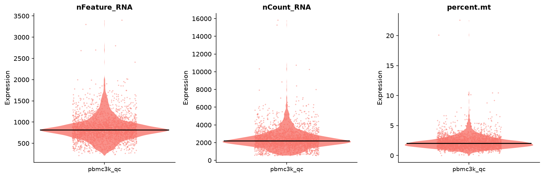 |
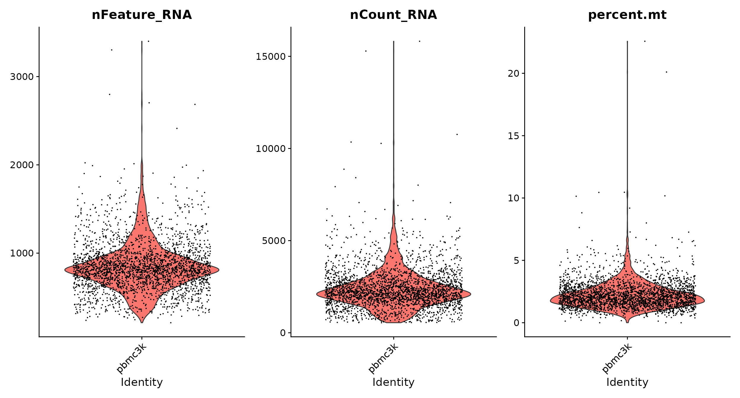
vln_plotaccepts both gene names and metadata column names asfeatures. Thegroup_byargument (default: active idents) controls the x-axis grouping — same as R'sgroup.by.
Step 4 · QC Scatter Plots
| R (Seurat) | Python (Truecell) |
|---|---|
 |
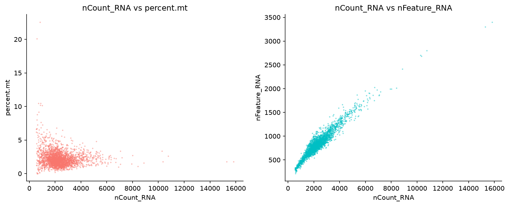 |
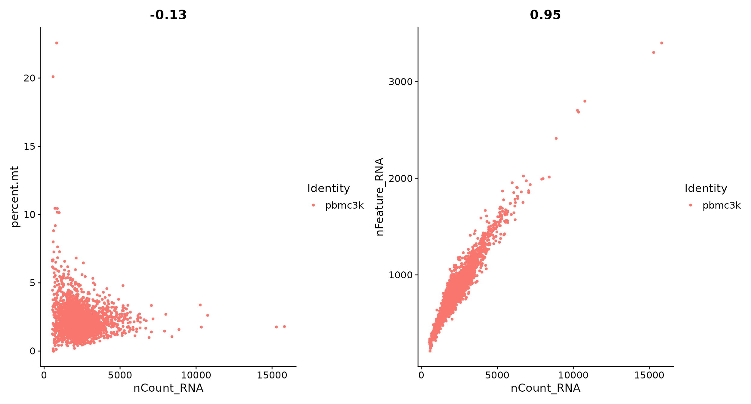
R uses
patchwork's+operator to combine plots. In Python, passfigsizeor usematplotlib.gridspecto arrange figures manually.
Step 5 · Filter Cells
| R (Seurat) | Python (Truecell) |
|---|---|
subset()works in both languages. Python uses boolean pandas indexing; the result is identical (2,638 cells).
Step 6 · Normalise Data
| R (Seurat) | Python (Truecell) |
|---|---|
Both apply
log1p(counts / total_counts × 10,000). Result is stored in thedatalayer of the active assay.
Step 7 · Highly Variable Features
| R (Seurat) | Python (Truecell) |
|---|---|
 |
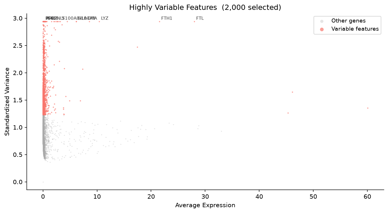 |
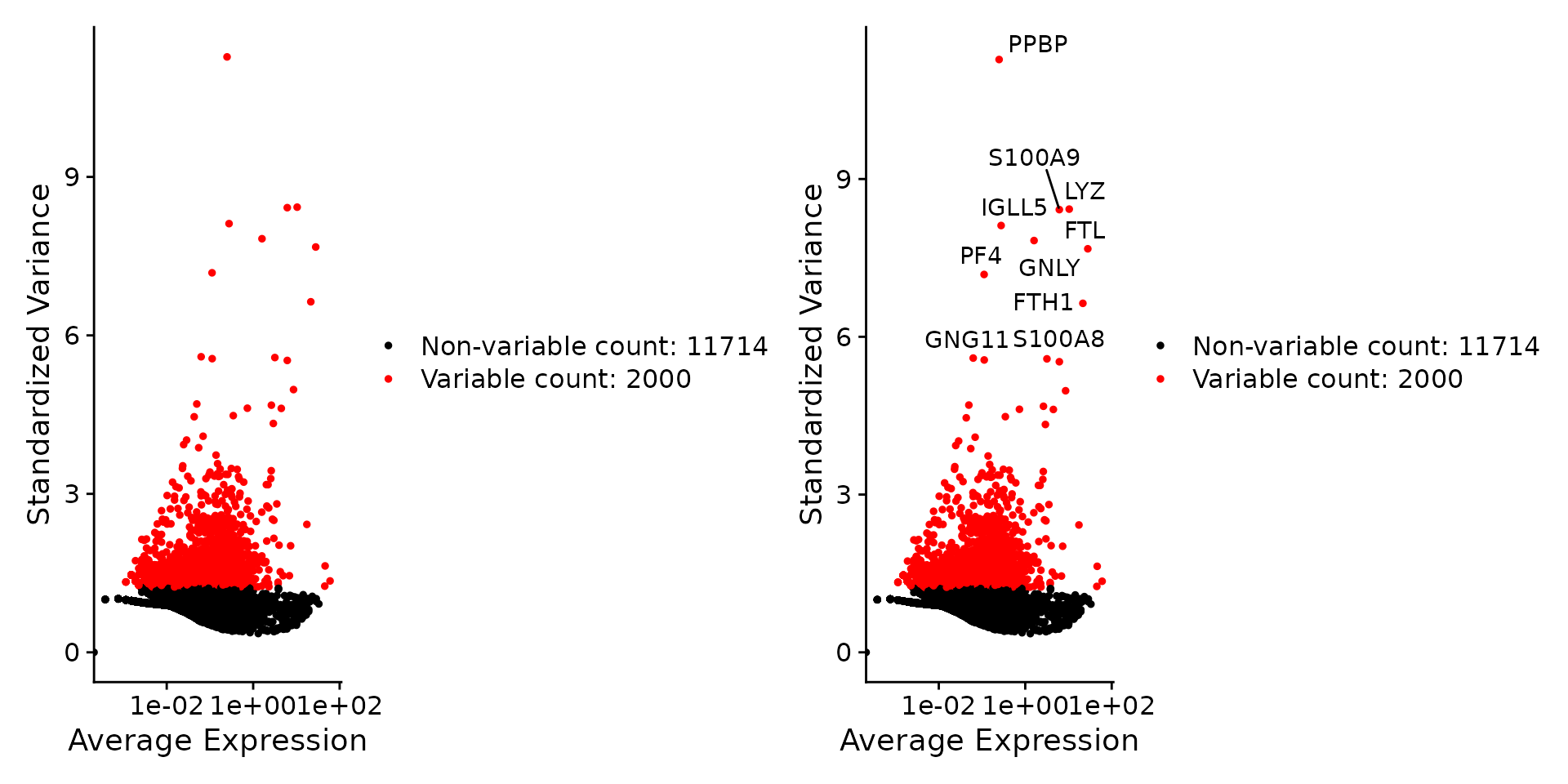
Both plots use Standardized Variance on the y-axis, matching R's
VariableFeaturePlot. Truecell reproduces Seurat'svstalgorithm faithfully: it fits the mean–variance LOESS on the raw counts, then ranks genes by the variance of the standardized values after clipping each tosqrt(n_cells)(the clip step that stops single-cell outliers from dominating). Both move the ten names apart: R'sLabelPoints(repel = TRUE)with ggrepel, which starts from random jitter, and Truecell'srepel=Truewith a deterministic placement worked out whenever the figure is drawn. Withoutrepel, names in the crowded top-right corner print over one another. Top-10 gene overlap: 9/10 (90%) — the samePPBP, LYZ, S100A9, IGLL5, GNLY, FTL, PF4, FTH1, S100A8HVGs as the R tutorial;GNG11sits just outside the top 10 (rank 11). Minor rank differences come from the LOESS implementation (R: Fortran; Python: local quadratic fit).
Step 8 · Scale Data
| R (Seurat) | Python (Truecell) |
|---|---|
Step 9 · PCA
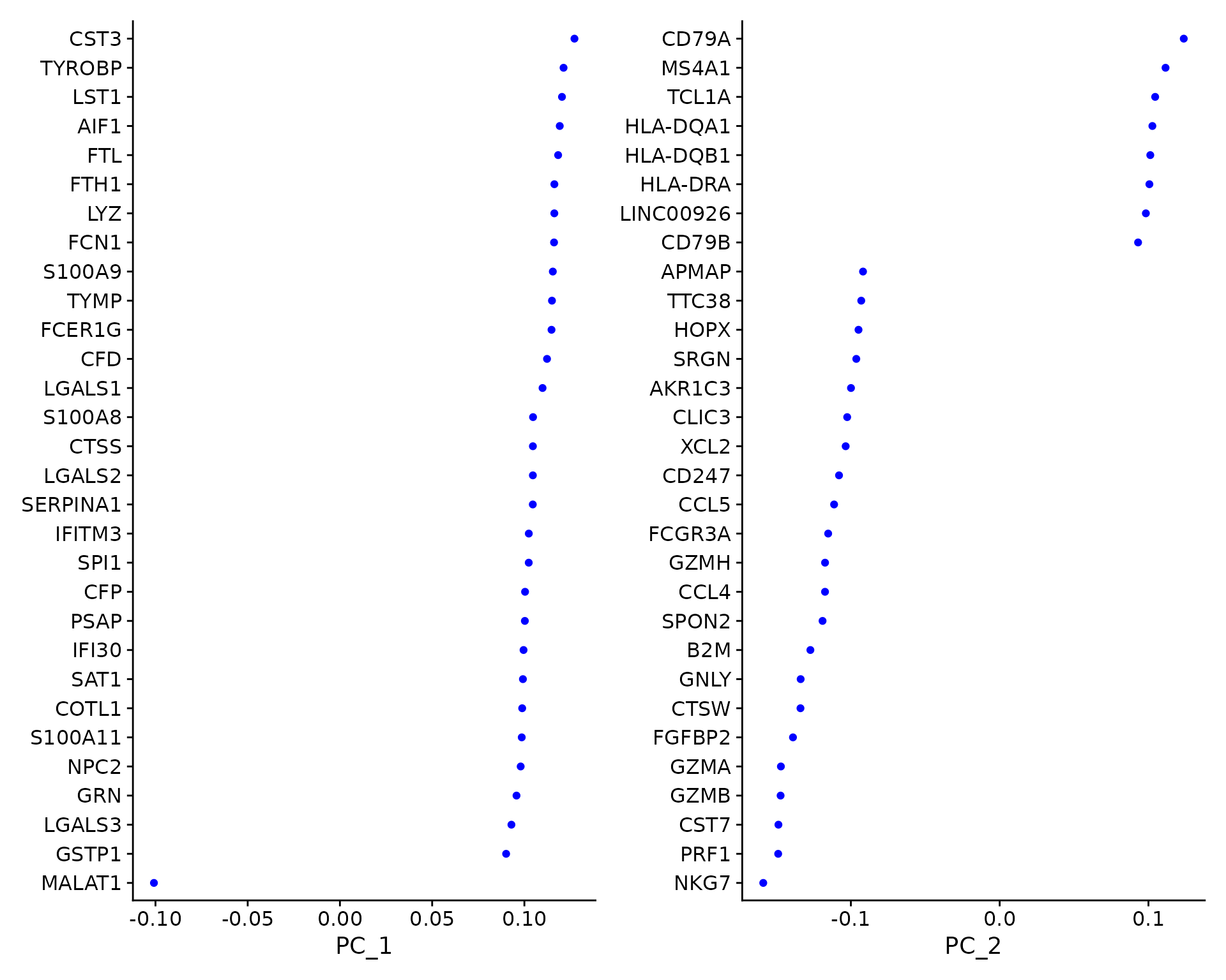
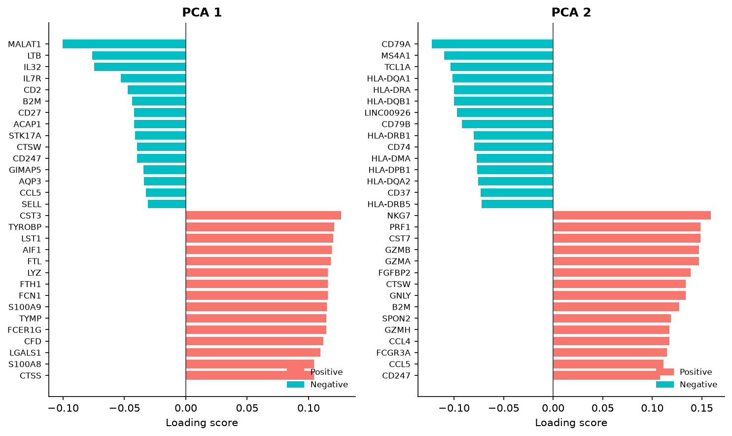
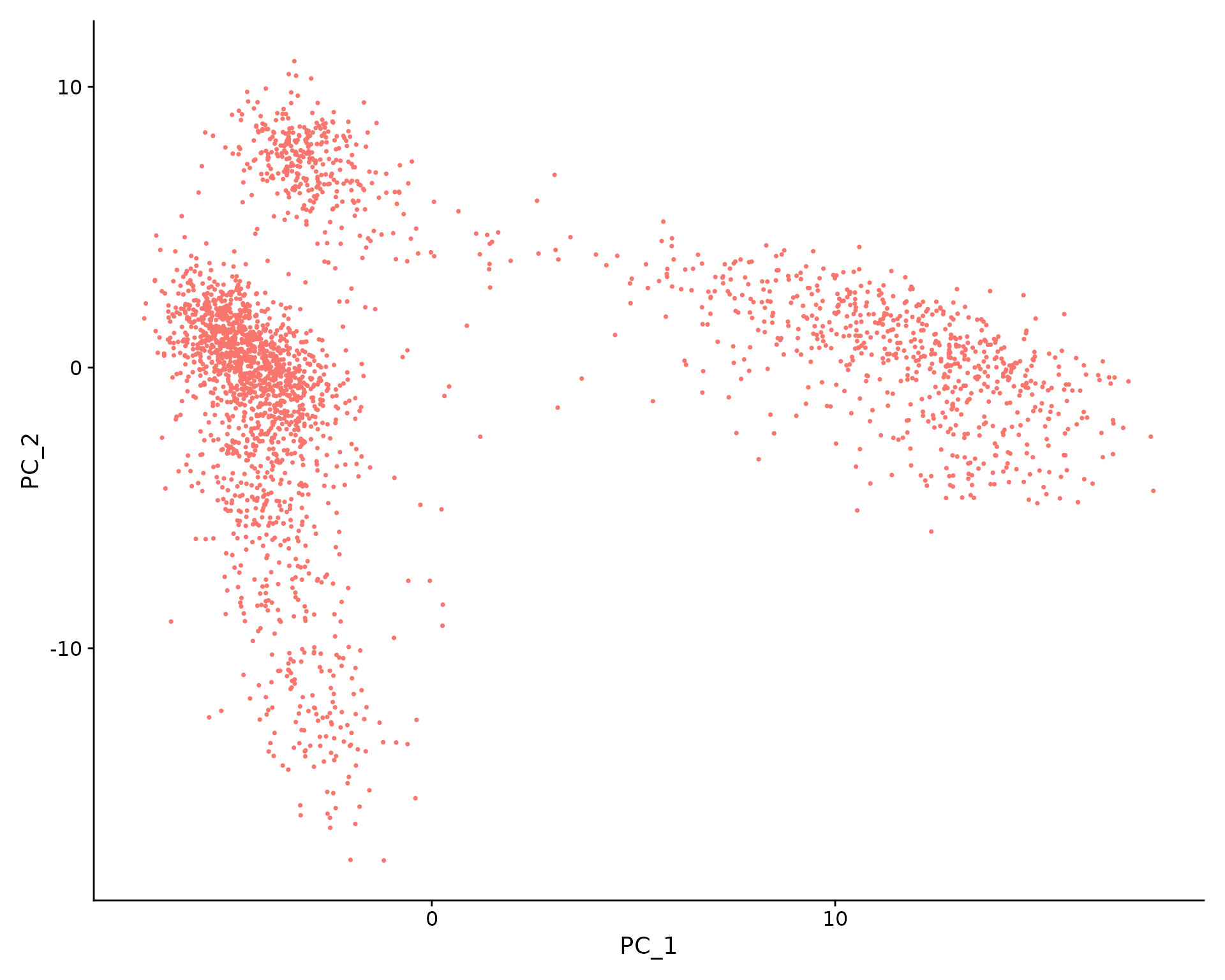
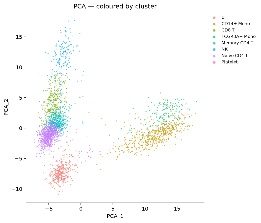
Both show horizontal bar charts of top loading genes per PC. The same myeloid genes dominate PC1 positively (CST3, TYROBP, LST1, AIF1) and T-cell genes dominate PC1 negatively (IL7R, LTB, IL32).
Step 10 · Elbow Plot — Choose Dimensionality
| R (Seurat) | Python (Truecell) |
|---|---|
 |
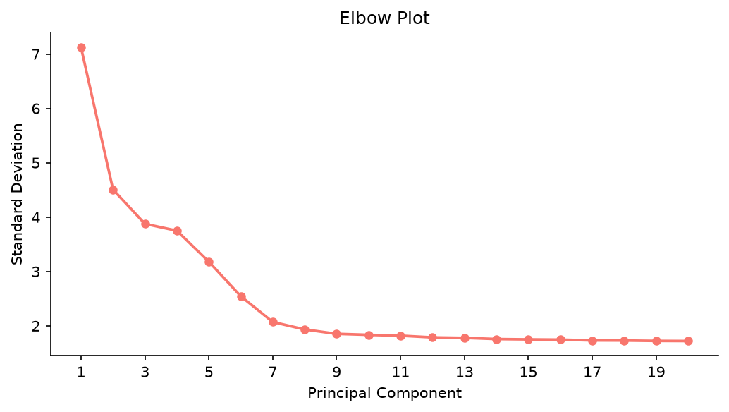 |
| PC | R stdev | Truecell stdev |
|---|---|---|
| 1 | ~6.8 | 6.766 |
| 2 | ~4.8 | 4.808 |
| 10 | ~1.7 | 1.684 |
Step 11 · Find Neighbors & Cluster
| R (Seurat) | Python (Truecell) |
|---|---|
Both run Seurat's modularity optimiser: truecell's is a translation of Seurat's C++, with the same ten restarts and the same random stream. At
resolution = 0.5each returns 9 clusters, numbered alike, and the two runs agree about 2,562 of the 2,638 cells (ARI 0.928). Given the same graph they would agree on every cell, so what is left comes from the graph, traced in the note below. The largest difference is the CD8 T cluster, 303 cells here and 270 in Seurat.
The whole sweep, not one point on it
Picking a resolution means running a few and comparing them, so a fidelity claim
pinned to a single setting says less than it looks like it does. The tutorial
runs find_clusters(pbmc, resolution=[0.4, 0.8, 1.2, 0.5]) — Seurat's own
vector idiom — and scores every one against R:
| resolution | truecell | Seurat | ARI | concordance |
|---|---|---|---|---|
| 0.4 | 9 | 9 | 0.9185 | 0.9701 |
| 0.5 | 9 | 9 | 0.9284 | 0.9712 |
| 0.8 | 11 | 11 | 0.9434 | 0.9746 |
| 1.2 | 11 | 12 | 0.9253 | 0.9632 |
The cluster count matches at 0.4, 0.5 and 0.8, and Seurat finds one more at 1.2. Agreement stays between 0.92 and 0.94 across the sweep. It used to fall from 0.90 to 0.80 as the resolution rose, while the two tools ran different optimisers.
0.5 is given last on purpose. Seurat leaves the object on the last resolution in the sequence, so every step below — UMAP, markers, annotation, the handoff — sees exactly the partition it saw before this sweep existed. The four outputs this tutorial writes are byte-identical to what it produced without it.
Each ARI now carries a declared band (CLUSTER_BANDS), for a reason: this
file documented ARI 0.938 at resolution 0.5 while measuring 0.899, across six
documents. The number had drifted — most likely with the graph fixes in #67–#71,
which moved cells between clusters — and with no band on it, nothing failed.
That is the same drift the DE tutorial's deseq2 top50 band did catch at the
time (25 → 22). The bands were re-measured when find_clusters became Seurat's
optimiser, which raised every ARI in the table above.
Where it comes from is traceable: the two runs keep the same 2,638 barcodes and agree on the per-gene VST means to 4.8e-14 and observed variances to 5.1e-14, but
variance.standardizeddepends on a degree-2 LOESS fit that differs by up to 2.6e-2 relative — andvariance.expected, the fit itself, differs by 2.5e-2, so the disagreement is the fit and only the fit. That flips 2 of the 2,000 variable features (both at ranks 1,982–2,000, and 0.03 apart in the fit), which moves the PCA slightly — matched |r| 0.9986 over the 10 dims clustering uses — which leaves the two SNN graphs 328 entries apart (194,226 against 194,554), which moves the cells the two partitions disagree about.Run
Rscript tutorials/pbmc3k_verify.Rthenpython tutorials/pbmc3k_tutorial.py --reportto reproduce every number in this note.
Step 12 · UMAP
| R (Seurat) | Python (Truecell) |
|---|---|
 |
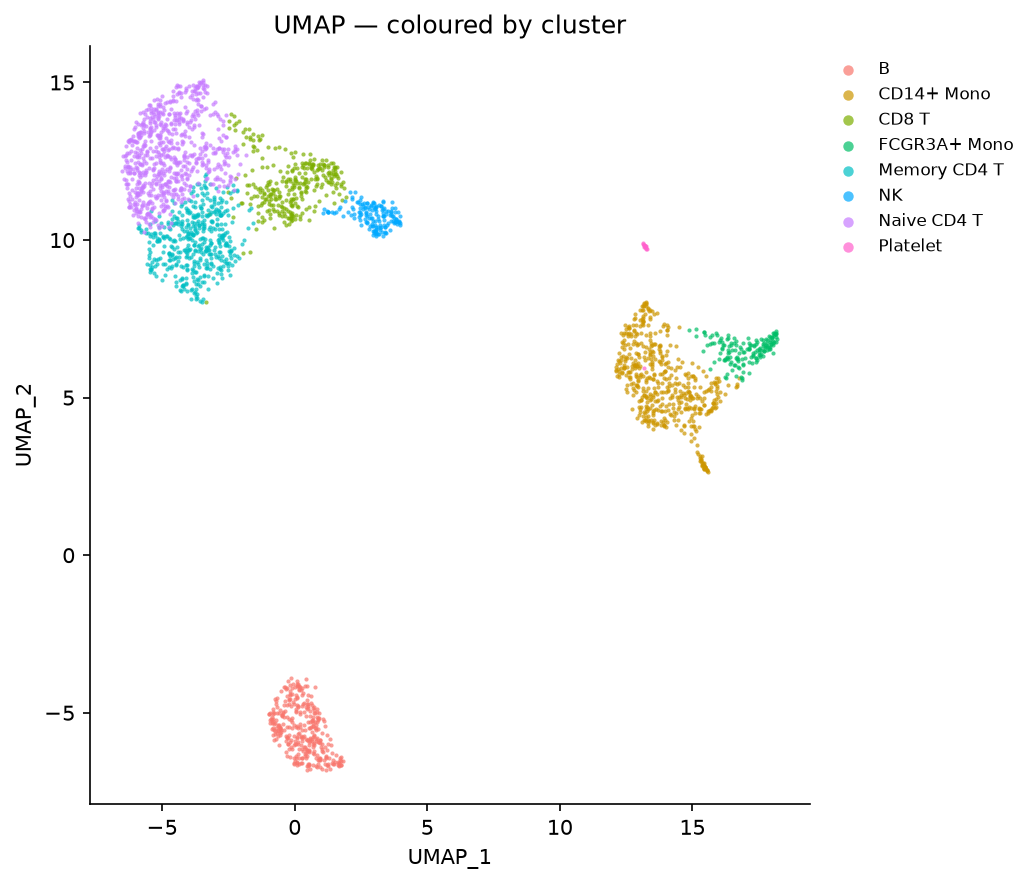 |
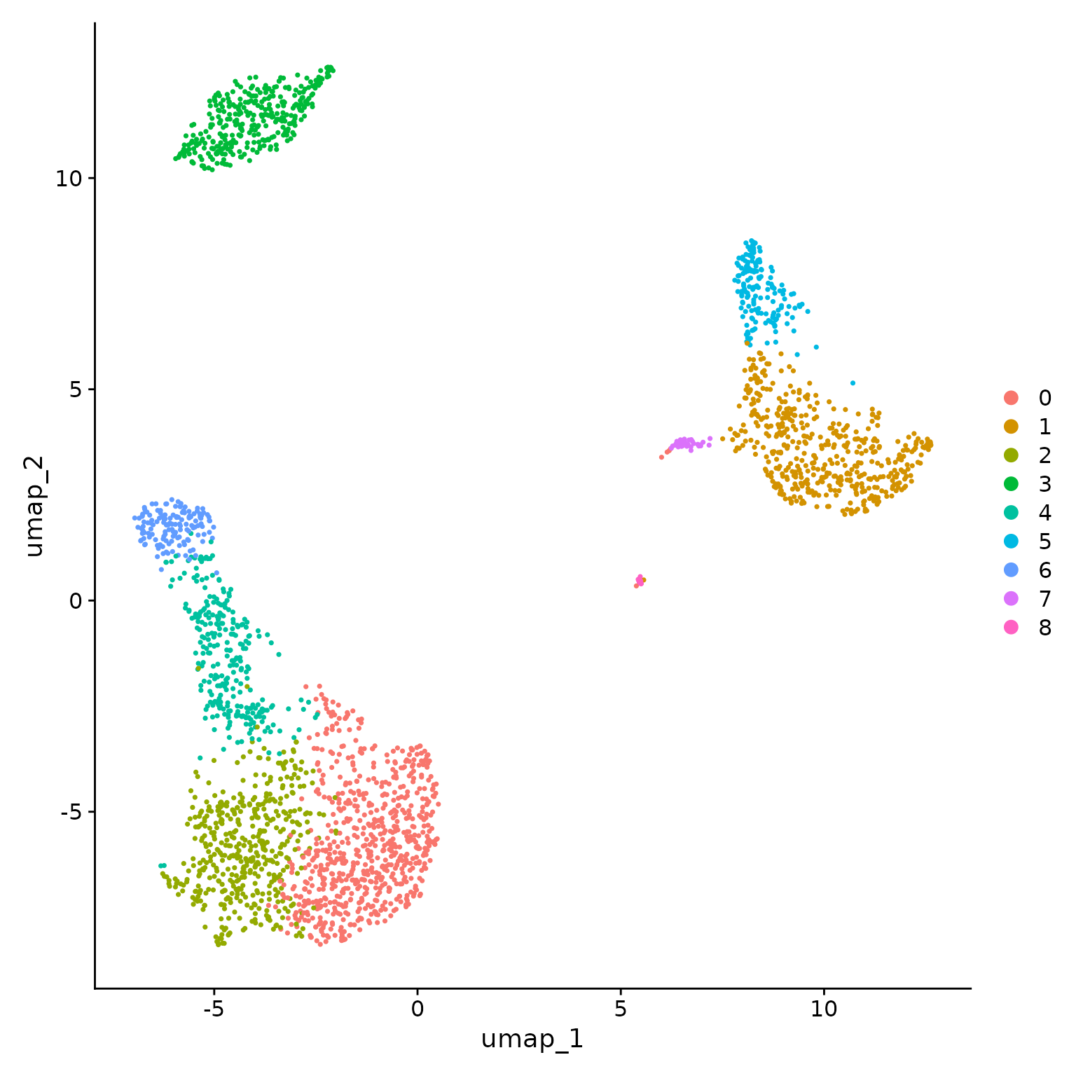
Note — UMAP layout difference is expected, not a bug. R Seurat uses the
uwotUMAP implementation while Python usesumap-learn. Both libraries apply the same UMAP algorithm but differ in initialisation strategy, nearest-neighbour graph construction, and optimisation details. As a result, the spatial arrangement of clusters will look different even with the same random seed — clusters may be rotated, reflected, or positioned further apart. This is a known and well-documented difference between the two libraries and does not indicate an error in the analysis. The important thing is that the same 9 biologically meaningful clusters are recovered in both, numbered alike: both tools number clusters by size.
Step 13 · Feature Plots — Canonical Markers
| R (Seurat) | Python (Truecell) |
|---|---|
 |
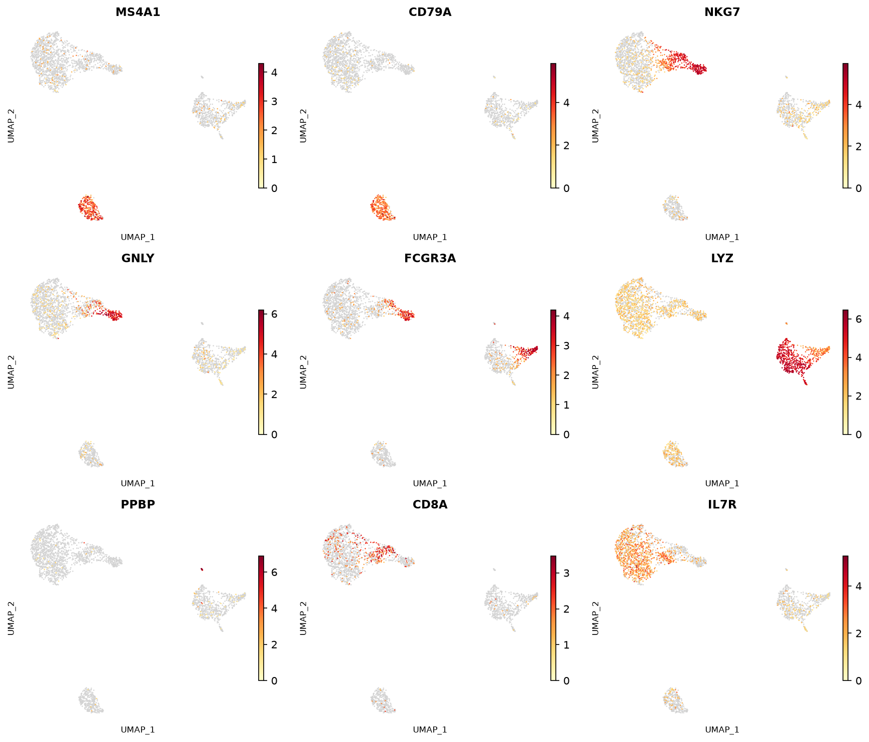 |
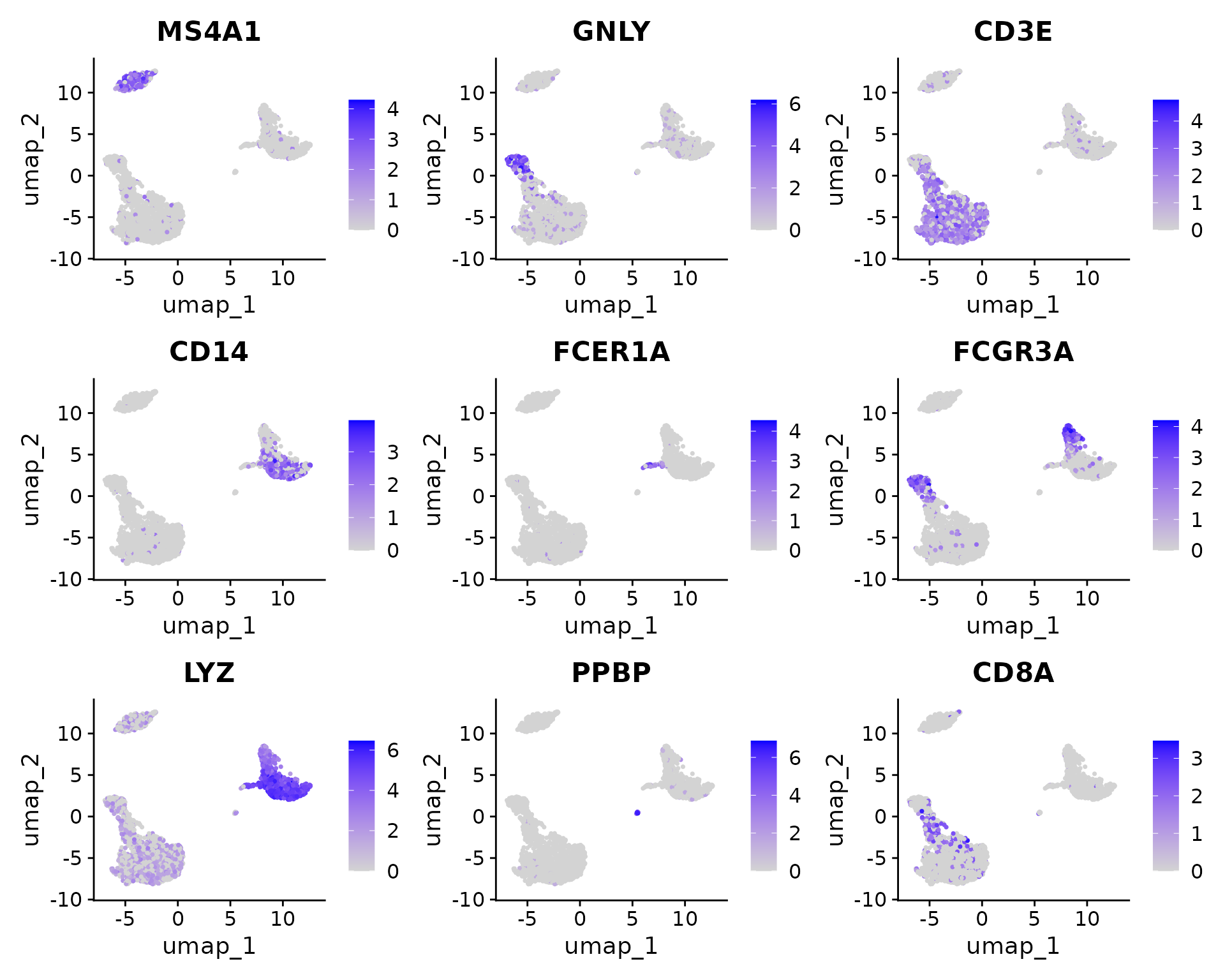
Note — minor visual differences are expected, not bugs. Both plots use the same yellow→red expression gradient and the
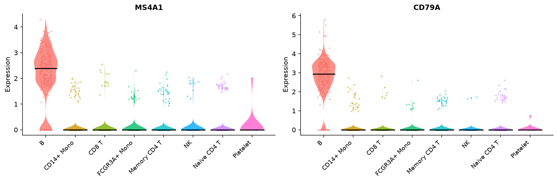
order=Truebehaviour (high-expression cells drawn on top). Cells with zero expression are rendered in light gray in both R and Truecell, making the expressing cells stand out clearly. The spatial layout of the underlying UMAP differs for the same reason described in Step 12 (different UMAP implementations), but the gene expression patterns are biologically identical: MS4A1/CD79A in B cells, NKG7/GNLY in NK cells, LYZ/FCGR3A in monocytes, PPBP in platelets, CD8A in CD8 T cells, and IL7R in T cells.
Step 14 · Violin Plots — Marker Expression
| R (Seurat) | Python (Truecell) |
|---|---|
 |
 |
 |
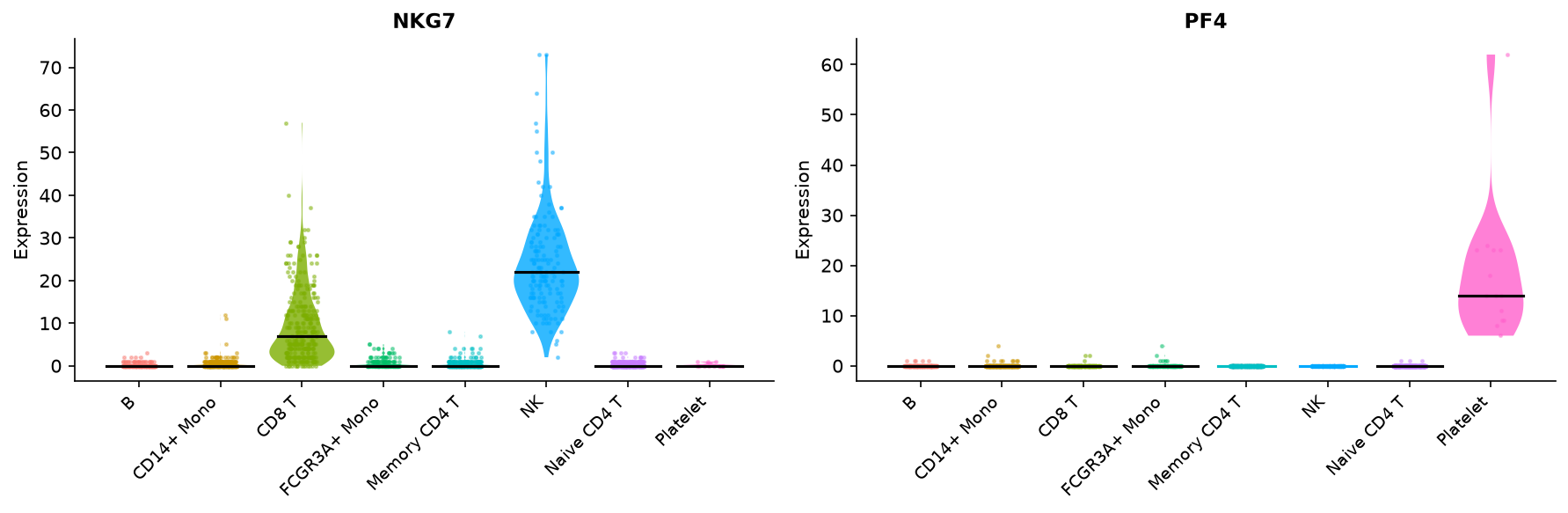 |
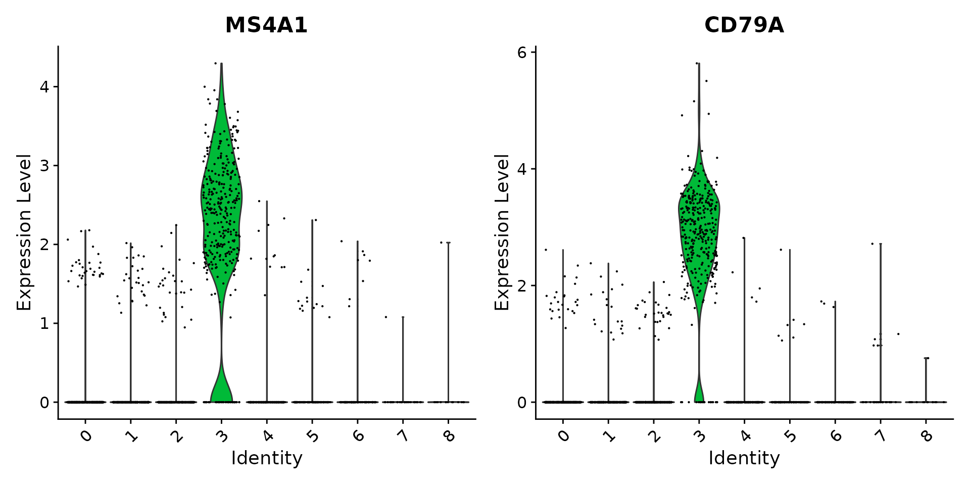
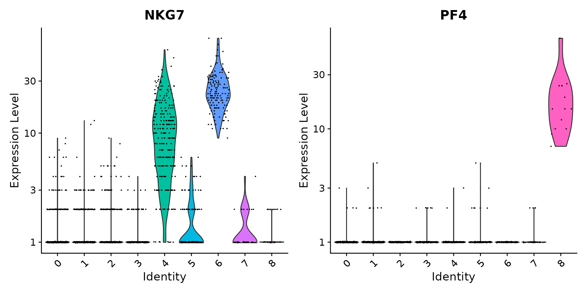
Both show cluster-specific marker expression. The
layerargument in Truecell maps directly to Seurat'sslotargument.
Step 15 · Find Markers
Argument names use
_instead of.(ident.1→ident_1,only.pos→only_pos). The returnedDataFramehas the same columns:p_val,avg_log2FC,pct.1,pct.2,p_val_adj,cluster,gene.
Step 16 · Expression Heatmap
| R (Seurat) | Python (Truecell) |
|---|---|
 |
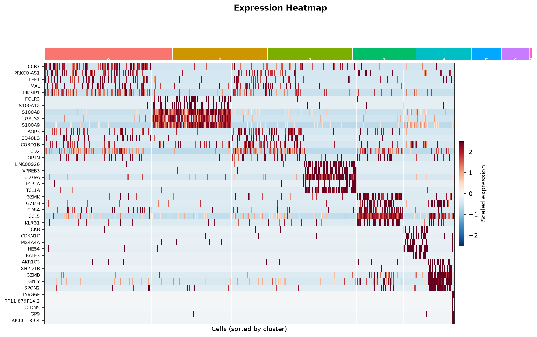 |
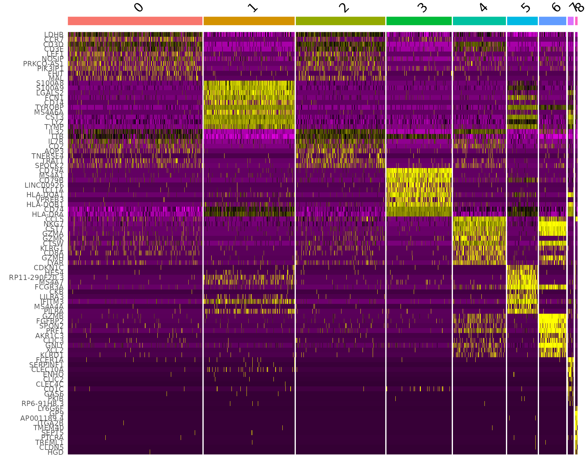
do_heatmapautomatically sorts cells by cluster and draws a coloured cluster bar at the top — matching R'sDoHeatmaplayout.NoLegend()in R is handled bydo_heatmap's internal layout.
Step 17 · Cell Type Annotation
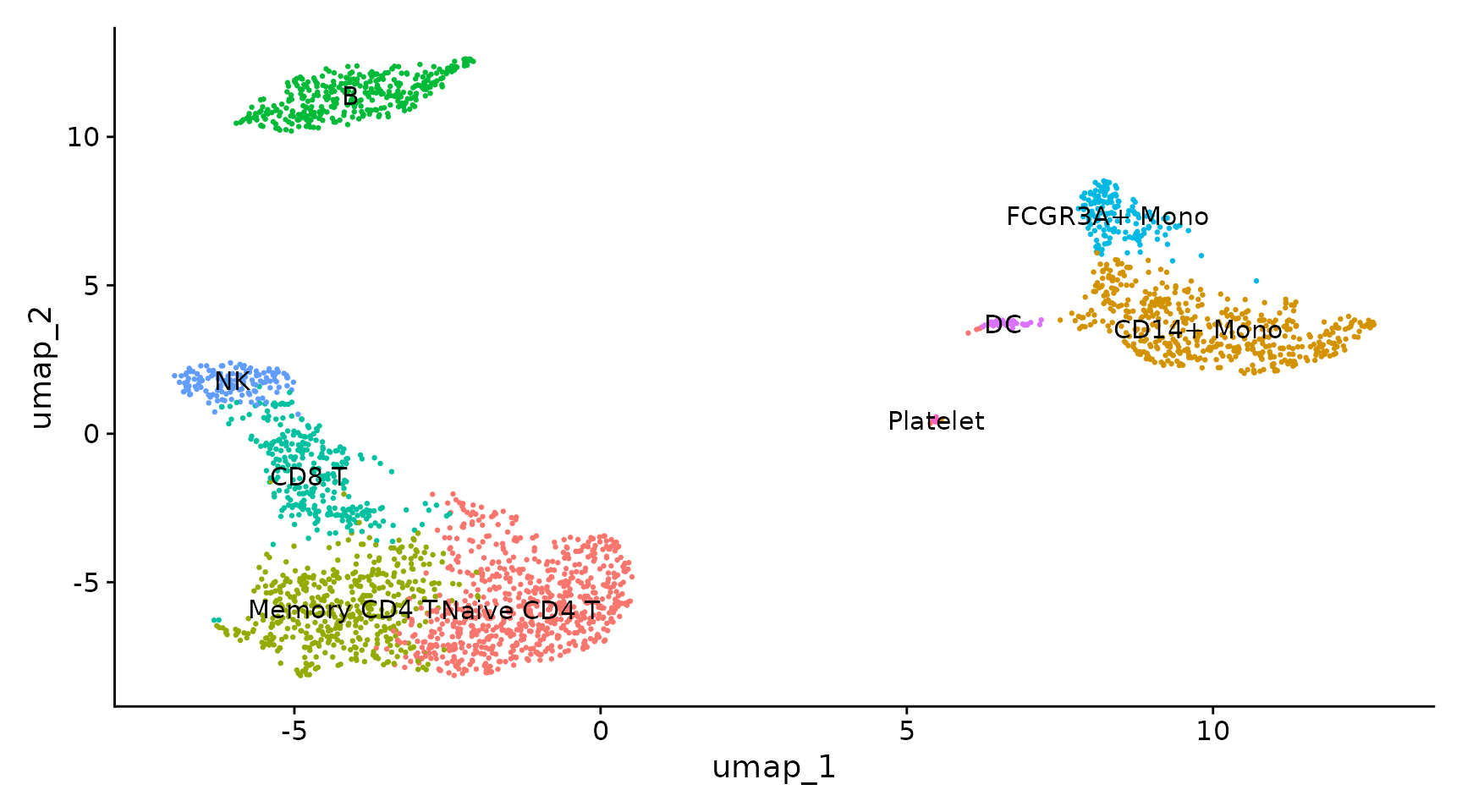
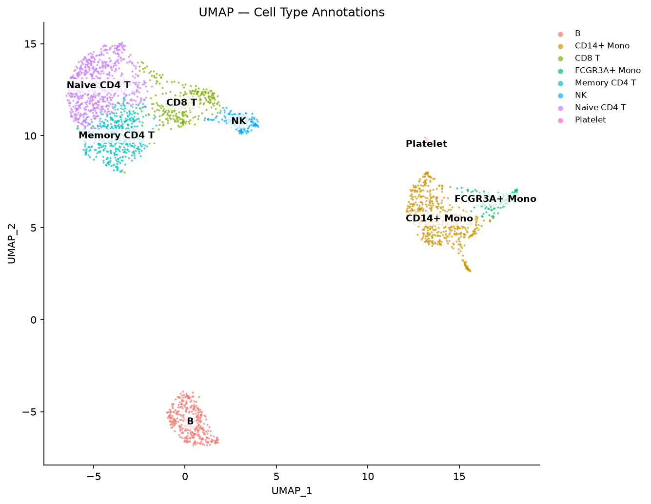
Both tools number clusters by size, and here the nine come out in the same order on both sides, so the map is Seurat's own, key for key. The two partitions agree at ARI 0.928 — see Step 11.
Both put each label at the median of its cluster's cells.
repel=Truethen moves a label only where it would overlap another, run off the panel, or cover more than half of a cluster's cells. Here that moves the labels of the small clusters off the cells they name: at its median, the "Platelet" label's box covered all 14 platelets.
Step 18 · Ridge Plot (Bonus)
| R (Seurat) | Python (Truecell) |
|---|---|
 |
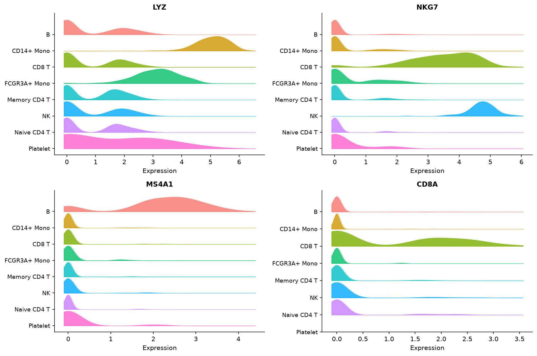 |
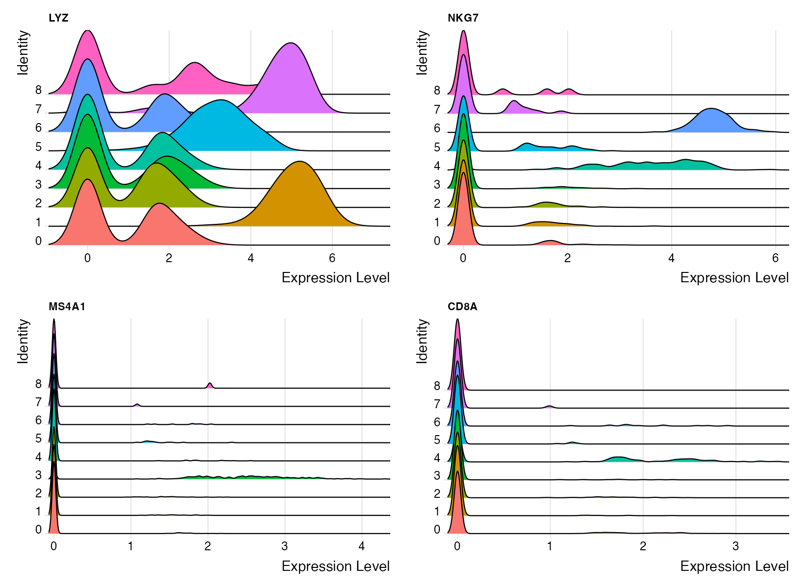
The published Seurat vignette prints no RidgePlot, so the R panel here is generated by
pbmc3k_verify.R(standard PBMC 3k workflow). R'sRidgePlotuses theggridgespackage; Truecell implements equivalent KDE ridgelines usingscipy.stats.gaussian_kde.
Quick Reference — API Translation
| Task | R (Seurat) | Python (Truecell) |
|---|---|---|
| Create object | CreateSeuratObject(counts, min.cells, min.features) |
create_truecell_object(counts, min_cells, min_features) |
| % mito genes | PercentageFeatureSet(pbmc, pattern="^MT-") |
percentage_feature_set(pbmc, pattern=r"^MT-", col_name=...) |
| Normalise | NormalizeData(pbmc, normalization.method, scale.factor) |
normalize_data(pbmc, normalization_method, scale_factor) |
| HVGs | FindVariableFeatures(pbmc, selection.method, nfeatures) |
find_variable_features(pbmc, selection_method, nfeatures) |
| Scale | ScaleData(pbmc, features) |
scale_data(pbmc, features) |
| PCA | RunPCA(pbmc, features, npcs) |
run_pca(pbmc, features, n_pcs) |
| Neighbors | FindNeighbors(pbmc, dims) |
find_neighbors(pbmc, dims, k_param) |
| Cluster | FindClusters(pbmc, resolution) |
find_clusters(pbmc, resolution, algorithm) |
| UMAP | RunUMAP(pbmc, dims) |
run_umap(pbmc, dims) |
| Markers | FindMarkers(pbmc, ident.1) |
find_markers(pbmc, ident_1) |
| All markers | FindAllMarkers(pbmc, only.pos, logfc.threshold) |
find_all_markers(pbmc, only_pos, logfc_threshold) |
| Rename idents | RenameIdents(pbmc, new.ids) |
pbmc.rename_idents(mapping_dict) |
| Subset | subset(pbmc, subset = condition) |
pbmc.subset(cells=keep_list) |
| Get expression | FetchData(pbmc, vars) |
pbmc.fetch_data(vars) |
| Access metadata | pbmc@meta.data |
pbmc.meta_data |
| Access assay | pbmc[["RNA"]] |
pbmc.assays["RNA"] |
| Active idents | Idents(pbmc) |
pbmc.idents |
Plotting API Translation
| R (Seurat) | Python (Truecell) | Key argument changes |
|---|---|---|
VlnPlot(pbmc, features, ncol, slot) |
vln_plot(pbmc, features, ncol, layer) |
slot → layer |
FeaturePlot(pbmc, features, order) |
feature_plot(pbmc, features, order) |
same |
DimPlot(pbmc, reduction, label, pt.size) |
dim_plot(pbmc, reduction, label, pt_size) |
. → _ |
ElbowPlot(pbmc) |
elbow_plot(pbmc) |
same |
FeatureScatter(pbmc, feature1, feature2) |
feature_scatter(pbmc, feature1, feature2) |
same |
VariableFeaturePlot(pbmc) |
variable_feature_plot(pbmc) |
same |
VizDimLoadings(pbmc, dims, reduction) |
viz_dim_loadings(pbmc, dims, reduction) |
same |
DimHeatmap(pbmc, dims, cells, balanced) |
dim_heatmap(pbmc, dims, cells, balanced) |
same |
DoHeatmap(pbmc, features) |
do_heatmap(pbmc, features) |
same |
RidgePlot(pbmc, features, ncol) |
ridge_plot(pbmc, features, ncol) |
same |
Plot output difference
# Python — functions return a Figure; display or save explicitly
fig = vln_plot(pbmc, features="LYZ")

# In a Jupyter notebook: just call the function — it displays inline
# To save:
fig.savefig("lyz_violin.png", dpi=150, bbox_inches="tight")
# To display interactively:
plt.show()
Reproducing All Plots
git clone https://github.com/GenomicAI/truecell.git
cd truecell
uv venv && source .venv/bin/activate   # Windows: .venv\Scripts\activate
uv pip install -e ".[analysis]"
python tutorials/generate_plots.py     # Truecell plots -> tutorials/figures/
Rscript tutorials/pbmc3k_verify.R      # R Seurat RidgePlot + the numeric handoff
Every other R panel in this tutorial links the canonical
Seurat vignette image;
only the RidgePlot (which the vignette omits) is generated locally by
pbmc3k_verify.R.
Checking the numbers, not the pictures
Because the R panels are canonical images, every step above is compared by
eye. pbmc3k_verify.R also writes a numeric handoff — per-cell QC and PCA
keyed by barcode, per-gene VST statistics, the marker table, and a set of
scalar anchors — which --report compares:
python tutorials/pbmc3k_tutorial.py    # writes the Python side
Rscript tutorials/pbmc3k_verify.R      # writes the R side
python tutorials/pbmc3k_tutorial.py --report
Neither side is pinned to the other: both run their own pipeline from the same 10x bytes, which is what makes the comparison worth anything. What it reports on this dataset:
| truecell vs Seurat 5.5.1 | |
|---|---|
| Cells surviving QC | the same 2,638 barcodes; nCount and nFeature exact, percent.mt to 5.3e-15 |
| VST per gene (13,714) | mean 4.8e-14 · variance 1.6e-11 · variance.expected 2.5e-2 · variance.standardized 2.6e-2, all relative |
| Variable features | 1,998 of 2,000 shared, rank Spearman 0.9999 |
| PCA (10 dims) | matched |r| mean 0.9986, min 0.9905, no reordering |
| kNN graph | 52,760 on both (2,638 × 20) |
| Clusters | 9 vs 9 — ARI 0.928, concordance 0.971 (see Step 11) |
| Markers, where the clusters hold identical cells | identical gene sets (151/151, 927/927 and 242/242), avg_log2FC to 4.9e-15, 5.3e-15 and 4.6e-14 respectively |
That last row is the one to read carefully. Three clusters — B cells, dendritic cells and platelets — came out with exactly the same membership on both sides, and on those three the differential expression agrees gene for gene and to machine precision. So the marker differences elsewhere are downstream of the clustering, not of the DE code.
Two notes on reading the report's marker table:
top10 by pis not the right column to judge. R's Wilcoxon p-values underflow to exactly 0 for the strongest markers — between 40 and 302 genes per cluster on this dataset — so Seurat's own top-10 ordering is decided by its fold-change tie-break, not by p.top10 by FC, which both tools resolve exactly, runs 8–10 of 10.- Building this handoff found a real defect in
find_all_markers: it was missing Seurat'sreturn.thresh = 0.01, so it returned rows Seurat does not. It now applies the same filter and breaks p-value ties on descendingavg_log2FCthe wayFindAllMarkersdoes.
References
Hao Y, Stuart T, Kowalski MH, et al. (2024). Dictionary learning for integrative, multimodal and scalable single-cell analysis. Nature Biotechnology, 42, 293–304. https://doi.org/10.1038/s41587-023-01767-y
Stuart T, Butler A, Hoffman P, et al. (2019). Comprehensive Integration of Single-Cell Data. Cell, 177(7), 1888–1902. https://doi.org/10.1016/j.cell.2019.05.031
10x Genomics (2016). 3k PBMCs from a Healthy Donor. https://www.10xgenomics.com/resources/datasets/3-k-pb-mcs-from-a-healthy-donor-1-standard-1-1-0